PGFPlots就是一个功能强大的绘图宏集,比较擅长绘制由数据生成的图,比如曲线图 (line plot)、散点图 (scatter plot)、柱状图 (bar plot)等,本身其基于TiKZ开发的,语法方面与TiKZ非常一致,在这篇文章中,我们介绍一些 PGFPlots 的基本绘图功能。
1-绘制统计图
统计图常被用于数据分析。下面给出一些用 PGFPlots 绘制统计图的示例。
1.1 线图
线图有折线图和光滑折线图两种,我们用一个例子来演示两种线图的画法。例1 给出一组数据 {(0,4),(1,1),(2,2),(3,5),(4,6),(5,1)},绘制经过这些点的两种线图。绘制折线图的代码和结果如下:
\documentclass[a4paper]{article}    % 文件类型是A4纸的文章
\usepackage{pgfplots}               % 使用pgfplots绘图工具包
\pgfplotsset{width=7cm,compat=1.13} % 图片绘制的宽度是7cm,使用的pgfplots版本为1.13
\begin{document}                    % 文档开始
\begin{tikzpicture}                 % 绘图开始
\begin{axis}                        % 添加坐标
\addplot+[sharp plot]               % 调用绘图函数,并设置绘图的类型是折线图
coordinates                         % 声明是在迪卡尔坐标系中的数据
{                                   % 输入数据
 (0,4) (1,1) (2,2)
 (3,5) (4,6) (5,1)
};
\end{axis}                         % 结束坐标
\end{tikzpicture}                  % 绘图结束
\end{document}                     %
下面是绘制光滑折线图的代码和结果:
\documentclass[a4paper]{article}
\usepackage{pgfplots}
\pgfplotsset{width=7cm,compat=1.13}
\begin{document}
\begin{tikzpicture}
\begin{axis}
\addplot+[smooth]                    % 设置绘图的类型是光滑线图
coordinates
{
 (0,4) (1,1) (2,2)
 (3,5) (4,6) (5,1)
};
\end{axis}
\end{tikzpicture}
\end{document}
1.2 条形图
条形图常用于展示各项目间的比较结果。例2 给出一组数据 {(0,4),(1,1),(2,2),(3,5),(4,6),(5,1)},绘制一般条形图。代码和结果如下:
\documentclass[a4paper]{article}
\usepackage{pgfplots}
\pgfplotsset{width=7cm,compat=1.13}
\begin{document}
\begin{tikzpicture}
\begin{axis}
\addplot+[ybar]                      % 绘制关于y坐标的条形图
coordinates
{
 (0,4) (1,1) (2,2)
 (3,5) (4,6) (5,1)
};
\end{axis}
\end{tikzpicture}
\end{document} 下面的例子演示如何对条形图进行填充来加强数据间的对比。例3 根据数据 {(0,4),(1,1),(2,2),(3,5),(4,6),(5,1)} 绘制蓝色边界、红色填充的条形图;同时,根据数据{(0,3),(1,4),(2,2),(3,9),(4,6),(5,2)} 绘制黑色边界、蓝色填充的条形图。代码和结果如下:
\documentclass{standalone}
\usepackage{pgfplots}
\pgfplotsset{width=7cm,compat=1.13}
\begin{document}
\begin{tikzpicture}
\begin{axis}[ybar,enlargelimits=0.15] % 绘制关于y坐标的条形图,条形之间的最大间隔是0.15cm
\addplot[draw=blue,fill=red] % 蓝色边界、红色填充
coordinates
{
(0,4) (1,1) (2,2)
(3,5) (4,6) (5,1)
};
\addplot[draw=black,fill=blue] % 黑色边界、蓝色填充
coordinates
{
(0,3) (1,4) (2,2)
(3,9) (4,6) (5,2)
};
\end{axis}
\end{tikzpicture}
\end{document}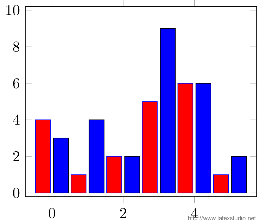 1.3 直方图

直方图又称为质量分布图,是最常用统计图之一。直方图的绘制方式与前面两种统计图略有不同,它依赖于 PGFPlots (?) 自身的计算功能。例4 绘制数据 {1,2,1,5,4,10,7,10,9,8,9,9} 的直方图的代码和结果如下:
\documentclass[a4paper]{article}
\usepackage{pgfplots}
\pgfplotsset{width=7cm,compat=1.13}
\begin{document}
\begin{tikzpicture}
\begin{axis}[ybar interval]   % 绘制y条形图,并且分隔出区间
\addplot[hist={bins=3}]       % 绘制图像设置为直方图,组距为3
table[row sep=\\,y index=0]   % 设置表的行以"\\"分隔,y的从0开始
{
 data\\                       % 输入数据
 1\\ 2\\ 1\\ 5\\ 4\\ 10\\
 7\\ 10\\ 9\\ 8\\ 9\\ 9\\
};
\end{axis}
\end{tikzpicture}
\end{document} 
2 线性回归
在 PGFPlots 中只能拟合一次函数,不能拟合更高次数的函数。下面给出一个示例。例5 绘制数据 {(1,1),(2,4),(3,9),(4,16),(5,25),(6,36)} 的线性回归绘图,代码和结果如下:
\documentclass[a4paper]{article}
\usepackage{pgfplots}
\usepackage{pgfplotstable}
\pgfplotsset{width=7cm,compat=1.13}
\begin{document}
\begin{tikzpicture}
\begin{axis}[legend pos=outer north east] % 将图例放在图外,位于图的东北角
\addplot
table                               % 绘制原始数据的折线图
{           		                % X,Y的原始数据
 X Y
 1 1
 2 4
 3 9
 4 16
 5 25
 6 36
};
\addplot
table[y={create col/linear regression={y=Y}}] % 对输入的数据作线性回归
{
 X Y
 1 1
 2 4
 3 9
 4 16
 5 25
 6 36
};
\addlegendentry{$y(x)$}          % 给第一个图像添加图例,即原始函数y(x)
\addlegendentry{                 % 给第二个图像添加图例,即线性回归结果a*x+b
$\pgfmathprintnumber{\pgfplotstableregressiona} \cdot x
\pgfmathprintnumber[print sign]{\pgfplotstableregressionb}$}
\end{axis}
\end{tikzpicture}
\end{document}
3 绘制函数图像
PGFPlots 最重要的功能是绘制函数图像,用它绘制二维和三维函数图像非常的简单。接下来,我们将分别展示一些基本函数图像的绘制。
3.1 二维显式函数图像
例6 绘制三角函数 f(x)=sinx 和 g(x)=cosx 在定义域 [0,2π] 上的图像。
\documentclass[a4paper]{article}
\usepackage{pgfplots}
\pgfplotsset{width=7cm,compat=1.13}
\begin{document}
\begin{tikzpicture}
\begin{axis}
\addplot+[domain=0:2*pi]          % 设置函数的定义域
 {sin(deg(x))};                   % 输入显式函数
\addplot+[domain=0:2*pi]          % 设置函数的定义域
 {cos(deg(x))};                   % 输入显式函数
\end{axis}
\end{tikzpicture}
\end{document}
3.2 三维显式函数图像
例7 绘制函数 f(x,y)=x2+y2 的三维函数图像。
\documentclass[a4paper]{article}
\usepackage{pgfplots}
\usepgfplotslibrary{colorbrewer}
\pgfplotsset{width=7cm,compat=1.13}
\begin{document}
\begin{tikzpicture}
\begin{axis}[colorbar]         % 绘制坐标,并设置一个彩色指示条
\addplot3[surf]                % 绘制三维图
 {x^2+y^2};                    % 输入二元显式函数
\end{axis}
\end{tikzpicture}
\end{document}
我们也可以绘制一些漂亮而“复杂”的三维图像,如下图的“帽子图”。
\documentclass[a4paper]{article}
\usepackage{pgfplots}
\usepgfplotslibrary{colorbrewer}
\pgfplotsset{width=7cm,compat=1.13}
\begin{document}
\begin{tikzpicture}
\begin{axis}[
    title=Example using the mesh parameter, %图像的标题
    hide axis,                              %隐藏坐标
    colormap/cool,                          %颜色风格
]
\addplot3[
    mesh,                                   %绘制的三维图像是网格
    samples=50,                             %定义域分割数量
    domain=-8:8,                            %定义域
]
{sin(deg(sqrt(x^2+y^2)))/sqrt(x^2+y^2)};    %二元显式函数
\addlegendentry{$\frac{sin(r)}{r}$}         %添加图例
\end{axis}
\end{tikzpicture}
\end{document}
3.3 隐式函数图像
隐式函数图像的绘制非常复杂。(在 Matlab 中,我们可以利用 isosurface 函数直接绘制隐式函数图像。)接下来,我们给出一个具体的在 PGFPlots 中绘制隐式函数的示例。例8 绘制隐函数 x^2/100+y^2=1 的函数图像。我们将该隐函数转化为参数方程:x=10cost,y=sint,t定义域为 [0,2π]。
\documentclass{standalone}
\usepackage{pgfplots}
\pgfplotsset{compat=1.11}
\begin{document}
\begin{tikzpicture}
\begin{axis}[width=12cm,height=6cm,trig format plots=rad,variable=t]
\addplot[red,thick,domain=-2*pi:2*pi,samples=200]
({10*cos(t)},{sin(t)});
\draw (0,1) -- (0,-1) (-10,0) -- (10,0);
\end{axis}
\end{tikzpicture}
\end{document}
4 补充说明
4.1 条形图与直方图的区别
直方图相邻柱体之间没有间隔,而条形图则有。在条形图中,横轴上的数据是孤立的,是一个具体的数据;而在直方图中,横轴上的数据是连续的,是一个范围。条形图是用条形的高度表示频数的大小;而直方图是用长方形的面积表示频数。
4.2 为什么 PGFPlots 中只能绘制一次线性回归的图像
我猜测这是由计算的复杂度所致。我们可以使用公式我完成一次线性拟合;而二次(及以上)的回归模型是采用最小二乘法来进行拟合的,计算其系数需要求解一个系数矩阵为范德蒙德(Vandermonde)矩阵的线性方程组,计算非常复杂。
4.3 为什么 PGFPlots 中不能直接绘制隐式函数的图像
因为直接绘制隐式函数的图像涉及到求解方程(组),而且往往是求解非线性方程(组),需要的计算量将非常的庞大。比如说,含有两个未知变量的隐函数 f(x,y)=0,为了确定 x0 所对应的点 (x0,y0),我们需要求解方程 f(x0,y0)=0,这通常非常复杂。因此,我们一般都是通过隐式函数的参数方程来进行绘图。而有些隐函数求解参数方程非常难,甚至没有参数方程。总之,隐函数图像的绘制一般比较复杂,这也限制了绘制隐函数图像的工具包的开发。
4.4 一些未解决的疑问
线性回归的函数的实现细节。
哪种绘制隐式函数图像的方法比较好用,是转成参数的形式,还是转化成显式函数的形式?
下载区
本文例子合集下载:PGFplots-exfull更多例子参看:http://www.pgfplots.net/选自:http://blog.csdn.net/u010450214/article/details/50601641


求问如何修改线性回归中直线描点的颜色和点的形状